Wolfhound Pub: A Modern-Industrial Brand Identity
The Challenge
Design a cohesive, engaging identity for a fictional dining space that reflects both its imagined atmosphere and a strong sense of visual direction. The brand needed to feel rooted in tradition, but executed with modern sophistication.To capture the spirit of Wolfhound Pub, I designed a brand identity rooted in a modern-industrial aesthetic with subtle Irish inspiration. The goal was to communicate approachability and warmth while maintaining a strong, urban edge.
The Solution
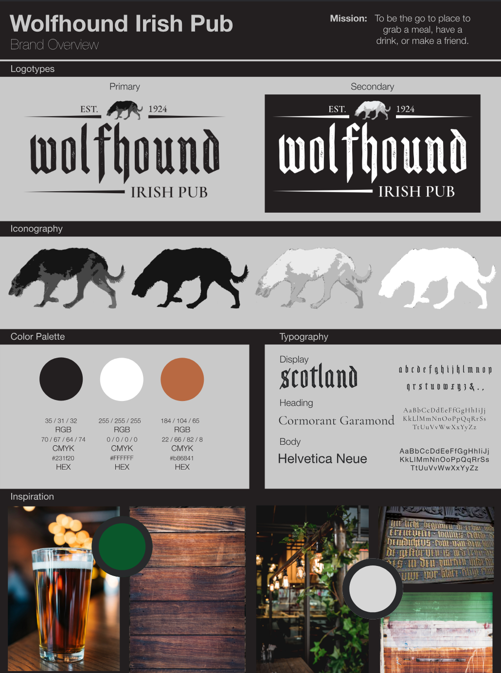
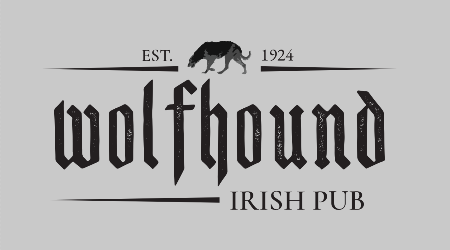
- Logo System: The logotypes and iconography are clean and minimal, with strong geometric structure. The primary logo features a bold typographic treatment paired with a stylized wolfhound symbol—representing loyalty, strength, and heritage.
- Color Palette: A carefully selected trio of deep charcoal black (#231f20), warm copper brown (#b86841), and crisp white (#ffffff) establishes a high-contrast, industrial feel. These colors evoke dark woods, aged metals, and warm lighting—drawing from classic pub interiors while keeping the look fresh and modern.
- Typography: The primary logo uses Scotland, a bold blackletter typeface that adds historical weight and character to the brand. Its sharp, angular forms evoke both heritage and strength—fitting for a pub identity. For supporting text, I paired Cormorant Garamond (a refined serif) with Helvetica Neue (a modern sans-serif), creating a balance of tradition and readability throughout menus, signage, and print materials.
- Visual Inspiration: Referencing materials like aged stone, wrought iron, and leather, I drew from both industrial and Celtic aesthetics. This helped define a tone that feels grounded in tradition, but refined for a modern audience.
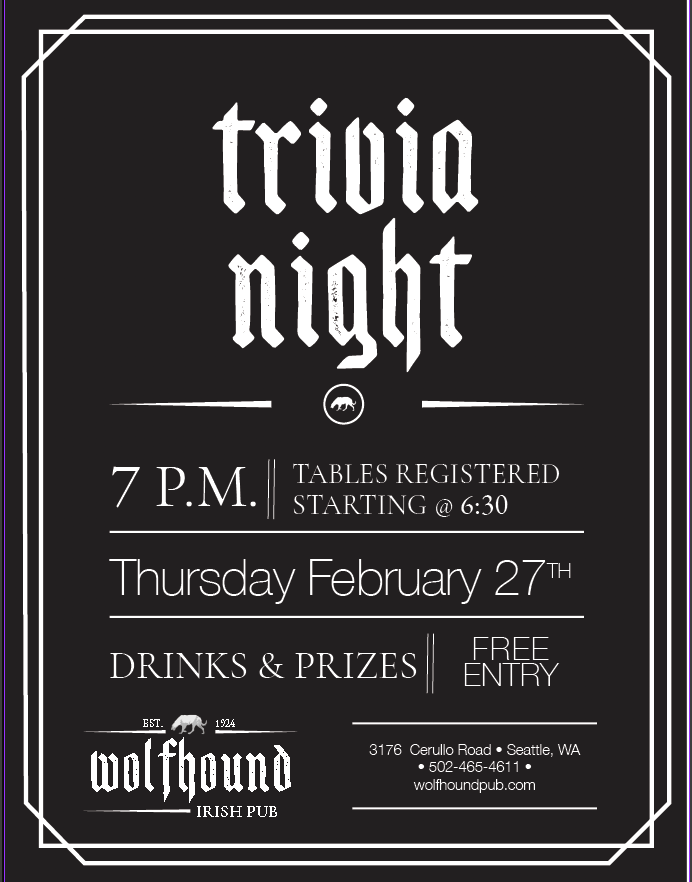
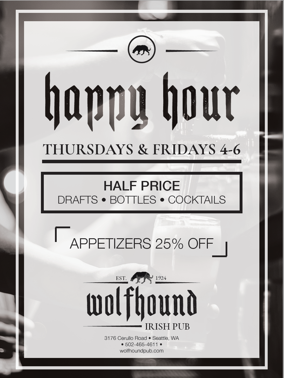
- Application: Across menus, stationery, and promotional materials, the visual language remains consistent: structured layouts, generous spacing, and minimal embellishment. These decisions ensure the brand feels confident and uncluttered, supporting the pub’s mission to be a place where people can relax, connect, and feel at home.
The Outcome
The final Wolfhound Pub brand identity feels polished, distinct, and grounded. It balances the rustic appeal of traditional pubs with modern visual clarity. This project allowed me to explore brand storytelling and cohesive visual systems, honing my skills in logo design, typography, layout, and presentation.